Article content
NEW YORK (AP) — PHOTOS?
Author of the article:

NEW YORK (AP) — PHOTOS?
Story continues below
Puma, you’re all boxed in. Nike, what have you done to the U.S. and Canada? Adidas, you’re making a few style waves.

With millions at stake in retail sales, this year’s World Cup in Qatar has soccer fans playing rate the shirt — and what to buy. So far, there’s no runaway winner that just might earn icon status like the sold-out-in-minutes bright green and chevron jersey of Nigeria during the last tournament in 2018.
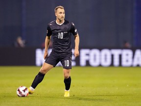
Which kits definitely don’t dazzle in the eyes of some hardcore fans — and a few outspoken players? Nike’s effort for the U.S. team, which didn’t qualify four years ago. An enlarged, simple country crest sits at the center on white home shirts perceived as bland, as opposed to classic. Nike relocated its swoosh logo to both sleeves.
Story continues below
A blue graphic at the neck has led to mocking comparisons to the Stay Puft marshmallow man of “Ghostbusters” fame. And the U.S. away kit features ice-dyed black Rorschach blotches against royal blue.
“It’s ugly,” said 33-year-old fan Ryan Bender of the former. “The away ones look like training jerseys.”
Bender is a lifelong soccer player, youth coach and jersey collector in Los Angeles. He had few niceties in general for many of the kits of the big three outfitters: Nike (13 countries), Adidas (7) and Puma (6). That’s especially so for the array of front boxes, shields and other containers where numbers will go courtesy of Puma on away kits for Senegal, Morocco, Uruguay and more.
There’s particular ire for Puma over the QR code-like symbol of Switzerland. The idea overall, Puma said, was to highlight player numbers. It has also been likened among the grumpy to the iPhone calendar icon.
Story continues below
“There’s a lot of lack of creativity there. And to be honest, a lot of them just look like jerseys you would find in a roadside shop,” Bender said of Puma’s kits.
While Bender has some favorites, and he isn’t alone when it comes to derision for the U.S. shirts, not everybody is a hater in the every-four-years World Cup sweepstakes over shirts. The top three companies are joined by six other brands with one country each. Nike, Puma and Adidas have made the use of recycled materials a priority.
“The Nike and Puma kits are stunning,” said Aron Solomon, 55, in Montreal. “Nike did such a great job bringing clean lines and just the right shade of colors. Case in point is the Qatar home Jersey.”
He was referring to the host’s maroon kit with a serrated line of white triangles trimming sleeves in a design evoking the country’s flag. Think shark’s teeth.
Story continues below
Denmark took a bite out of Qatar when it unveiled a black jersey to go with two other kits. The black shirts, with maker Hummel’s logo faded out, honor migrant workers who died during construction work for the tournament.
As for his own country, Canada, Solomon is unbothered that the rejuvenated Les Rouges will take the pitch for their first World Cup appearance in 36 years wearing the same template-based kits they’ve had since June 2021. The shirts are traditional red and white with a crest featuring a maple leaf.
Like a few U.S. players who speak publicly about their kits, Canada defender Sam Adekugbe is disappointed.
“I just feel like every team should get a new kit for the World Cup because it’s a symbolic event. I don’t hate it, but I would have liked to have gotten a new kit, just because it’s something to cherish,” he told The Athletic.
Story continues below
Nike cites a different design cycle for Canada as the reason the country is going without.
Solomon has no love for Adidas-designed shirts, particularly the home jerseys of powerhouse Germany, where he lived for four years. It features a fierce wide black vertical stripe down the center against a white background in homage to the country’s 1908 home shirt.
“It looks like they’re wearing a bib,” he said.
The Adidas shirts for four-time World Cup champs Germany, along with Argentina, Mexico and the other countries it outfitted, include the company’s signature triple-line trim on the shoulders in various colors. Sort of like sporty epaulets.
Perhaps the most polarizing kit of the competition is the away look for Mexico, which some consider too flashy and others think will endure like Nigeria’s shirts the last time around. The creamy white kit has an all-over red design of Mixtec art outlines in celebration of Mexico’s fighting spirit. There’s a nod on the inside back collar to the pre-Columbian deity Quetzalcoatl (so named by the Aztecs), aka the Feathered Serpent.
Story continues below
“They’re my most favorite of the whole tournament,” said mega soccer fan Khloe Lewis, 27, in Somerville, Massachusetts. “I like the pattern and the contrast, but also that it’s inspired by historic, traditional Mexican design.”
As a hot topic, debate over World Cup kits often churns among fans yearning for a jersey identity of their own.
“Kits get to the emotions. They’re something that’s very close to people’s hearts and it makes them very, very vocal about them,” said Mateo Kossman, a senior product manager on the Adidas soccer apparel team who worked on Mexico’s shirts.
Come Nov. 20, when the World Cup begins, soccer will dominate at the sports bar Das Beer Garden in Jupiter, Florida. Growing up in Caracas, 44-year-old co-owner Alex Marquez began playing the Beautiful Game in first grade. He roots for the U.S., Venezuela and Spain, the latter his parents’ home country.
Story continues below
Marquez is pleased with Spain’s classic home jersey in red from Adidas, worn with navy shorts and socks. The away kit — the aways being generally more adventurous — is another story. It has light blue swirls with faint digital lines on a white background and the country’s bright red and yellow flag colors for the shoulder stripes in a grand show of disharmony.
“It’s like the thing that goes around a baby’s crib,” Marquez said of the swirls.
The blog Four On Four called the look exquisite, dubbing the wavy design a “geometric jellyfish pattern.”
Argentina switched it up, color wise, for its away shirts. Adidas rolled out a classic white and blue stripe home kit but veered for the first time in the country’s history to a vibrant purple for the away jersey. It depicts the Sun of May and its long rays from the country’s flag, though the rays and a background design look like flames. The purple is meant to represent gender equality, and overall diversity and inclusion. And the Adidas triple lines on the shoulders match!
Story continues below
How has the purple played among World Cup fans?
“Like everything we create, it’s important that the story is understood and told,” said Andrew Dolan, an Adidas senior product manager who worked on the Argentina shirts. “I think everyone appreciates what we’re trying to do.”
At 10, Zain Ennaoui is a small fan with big opinions on soccer shirts. Of the new purple for Argentina, which has some soccer buffs rattled, the Brooklyn fifth-grader said politely, “It’s good in its own way.”
Zain supports Morocco, where his dad is from, but he, too, loves Mexico’s away extravaganza. He gets that most of the shirts among the 32 countries headed to Qatar have cultural meaning. That said, South Korea’s away kit of many colors (black with yellow, blue and red brush strokes) is a tough sell for him, despite its nod to Taegeukgi, the symbol on the country’s flag.
Story continues below
“It’s like someone thought it was a good idea to get a paint gun and spray it all over the place. It did not work,” Zain said.
It’s a toss up on which look for the U.S. is more roundly despised by critics. The soccer-obsessed site Footy Headlines rated Canada’s tragedy at the bottom among Nike’s efforts. The U.S. shirts were second to last.
“It looks like you’d wear it to a Grateful Dead concert,” said Kent Gethmann, 38, in Spencer, Iowa, of the blue and black away shirt.
That, the idea of lending street life to World Cup wear, might just be the point.
“I’d rock it,” Brandon Williams said of the same U.S. kit.
He’s a Los Angeles menswear stylist for celebrities and star athletes, though no soccer players yet.
“I’d wear it oversized with some hoochie daddy shorts (they’re really short), some clean white Nike Air Force Ones and a backward snapback,” Williams said. “I’d throw a sweater over my shoulders like Carlton from The Fresh Prince of Bel-Air, and I’m ready for Sunday brunch.”
——
Follow Leanne Italie on Twitter at https://twitter.com/litalie
——
AP World Cup coverage: https://apnews.com/hub/world-cup and https://twitter.com/AP–Sports
Story continues below